
Is ‘mobile responsive design’ the same as ‘mobile-first design’?
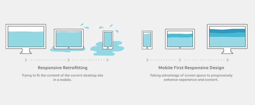
Mobile responsive design and mobile-first design have some of the same components, but their methods, approaches, and strategies are totally different. Mobile-first design is cost-effective and provides an optimal UX in all screen sizes.
What is a Mobile-First Design?
Mobile-first design is exactly as its name suggests: sketching, prototyping and designing for mobile-first and then scaling up to larger screen devices from there. Mobile-first ensures that you deliver the right User Experience (UX) to the right screen. Mobile-first design is a design philosophy and somewhat of a replacement for strategies such as responsive design or adaptive design.

How mobile-first design is different from responsive web design?
Responsive web design is a web design method that enables the web to fit the screens of different devices automatically, displaying the content in a way that people feel comfortable. In other words, the website’s built for desktop users first and then made to work on mobile later.